

When a groundbreaking structure comes along, people notice. Some, like City Hall, are immediate faves, while others take longer to win hearts. Meet five modern icons that changed the way Torontonians view urban architecture.
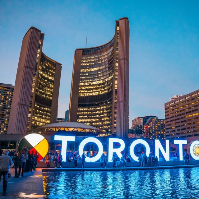
City Hall (City Centre)
1965
Architects: Viljo Revell with John B. Parkin Associates
During the international competition to design Toronto’s new City Hall in the late 1950s, architects were asked to create “a symbol of Toronto, a source of pride and pleasure to its citizens.” From more than 500 entries submitted, the jury selected Finnish architect Viljo Revell’s futuristic complex. Beyond its unusual curving form and extensive use of concrete, City Hall was unique in placing the flying saucer-like council chamber at its core and councillor offices along its front side, creating a sense that politicians couldn’t hide from the public.
When City Hall opened in September 1965, fears it would be a financial white elephant quickly vanished as Torontonians immediately embraced their new landmark. “It gives the metropolis a focus,” the Toronto Star declared. “It is the heart of Toronto’s future. It is the symbol of the new Toronto and we can rejoice in what that means.”
That prediction of City Hall’s future proved accurate. Its success encouraged further architectural experimentation during the downtown building boom, which followed its opening. Its symbolic power of representing the hopes of the city is reflected by its use in the official city logo. Most of all, combined with Nathan Phillips Square, it succeeds as a place for Torontonians to gather to have fun, celebrate our triumphs, reflect on injustices and remember public figures. As critic Alex Bozikovic observes in Toronto Architecture: A City Guide, City Hall remains “one of Toronto’s very best buildings, and one of the boldest leaps forward in the city’s history.”
Toronto-Dominion Centre (Financial District)
1963 to 1969
Architects: Ludwig Mies van der Rohe, John B. Parkin Associates and Bregman & Hamann
The modernist, black glass Toronto-Dominion Centre was the first of the wave of skyscrapers that dominate downtown today. Mies van der Rohe’s design was one of the first Toronto buildings to earn international praise. Its minimalist appearance was a change from the ornate details most financial institutions had favoured. “Mies’s signature black tower,” writer John Martins-Manteiga noted in his book Mean City, “is to architecture what Chanel’s little black dress is to fashion.” Within a few years, it was joined by the Commerce Court complex, followed by mid–and late–1970s giants First Canadian Place and Royal Bank Plaza.
Beyond the distinctive look of the original two towers, and its single-storey banking pavilion on King Street, the Toronto-Dominion Centre changed how downtown workers went about their day. Its air-conditioned underground shopping concourse was, as an early ad boasted, “planned for people—for work and enterprise, for inspiration, for recreation.” It evolved into one of the original pieces of the PATH underground system.
While it has been added onto several times since its original phase, it retains its distinctive appearance, adding mid-century elegance to the neighbourhood.
John P. Robarts Research Library (Annex)
1971 to 1973
Architects: Warner Burns Toan & Lunde with Mathers & Haldenby
That Robarts Library stood out in its neighbourhood when it opened in 1973 is an understatement. There was its 14-storey height, dwarfing anything else that was existing on the University of Toronto’s central campus. There was its unique shape, compared when viewed from above to a maple leaf or peacock. Most of all, there was its brutalist form, clothed in 100,000 cubic yards of concrete. Little wonder it quickly earned the nickname Fort Book.
Early on, it drew as much controversy for a decision, later overturned, to only allow graduate students access to its book stacks as it did for its boundary-pushing, stark appearance. “Robarts is unsettling,” architecture professor Mary Lou Lobsinger observed in the book Concrete Toronto. “It resists the comfortable familiarity expected of a building over time.” Author Umberto Eco was rumoured to be inspired by its almost-medieval appearance when creating the library in his novel The Name of the Rose.
Over time, younger generations of architects appreciated Robarts as a fine example of brutalism, reflected by the heritage protection it received in the late 1990s. “Even the harshest of critics had to admit that the building was well-constructed and beautifully detailed,” Lobsinger noted.
Sharp Centre for Design at OCAD University (City Centre)
2004
Architects: Will Alsop, with Robbie/Young+Wright
When the Ontario College of Art and Design (now OCAD University) looked to expand its downtown campus in the early 2000s, it could have gone a conventional route and slightly modified existing buildings or built on a nearby parking lot. “But there’s no magic in that,” British architect Will Alsop told the New York Times.
What Alsop devised was far more audaciously appropriate for an art college. Above the school’s core building, he designed what has been called a “tabletop” or a “shoebox in the sky.” Sitting atop colourful steel pipe stilts rising 26.8 metres (88 feet) above the ground, the structure allowed nearby residents to maintain their view of Grange Park and created space for the park to be enlarged.
“Few buildings have dominated Toronto’s conversation like this one,” Bozikovic observes. The Sharp Centre received plenty of international praise and awards. In 2015, it was included in Azure magazine’s roundup of 10 buildings around the globe that showed how cities could be transformed by architecture. Azure observed that everything about Alsop’s creation “screams to be heard, seen and loved, which it most certainly is.”
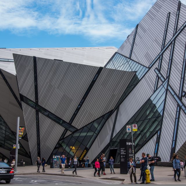
Michael Lee-Chin Crystal at the Royal Ontario Museum (ROM) (Yorkville)
2007
Architects: Daniel Libeskind with B+H Architects
If you want to engage a Torontonian in an animated conversation about architecture, just say “ROM Crystal.” It’s hard to run across anyone who feels indifferent about Daniel Libeskind’s renegade design. Originally sketched on a napkin, it appeared at a time when Toronto experienced a renaissance of cultural institution revamps by starchitects like Will Alsop and Frank Gehry.
Those who chose the Crystal over competing designs felt it would show that the ROM was ready to be at the forefront of contemporary architectural trends. “Libeskind’s design was that one idea that could fundamentally transform our city, both physically and symbolically,” ROM board of governors chair Rob Pierce told the Toronto Star.
Beyond its eye-grabbing design, the ROM Crystal allowed the museum to open a larger entrance area off Bloor Street. It also created a better flow for visitors to enjoy over 300,000 square feet of new or revamped exhibition and public space.
As for winning over any remaining naysayers, that may just be a matter of time. While locals will happily argue its merits, visitors have fully embraced it–according to TripAdvisor users, the ROM is among the top five attractions in Toronto.


